
The Idea
I was approached by a group of enthusiastic art students who called themselves “Bakers Dozen”, they asked me to create them a poster to advertise their upcoming art exhibition in Bristol.
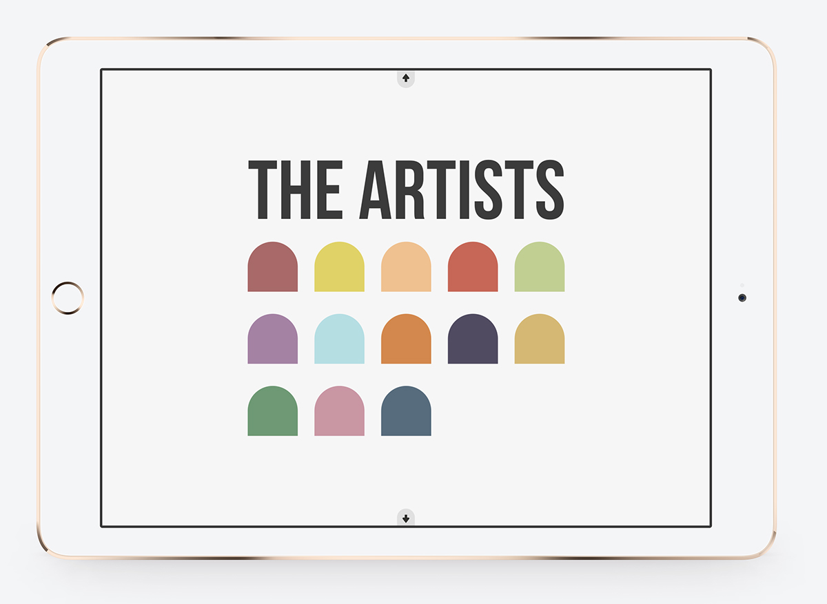
There were Thirteen of them and they all had different areas of expertise. Because of this, they wanted a way to promote themselves that didn’t give too much away or lean too much towards one style of art. So, They wanted something that was minimalist and not too biased.
Because of this, I knew exactly the style I wanted to go with, a colourful yet simple design, which focused on their name rather than their different expertise. I used this opportunity to also design them a landing page.
I didn’t want to create a standard, one page landing page, but instead, a multipage website which will give out all their information without having an overloading amount of text on one screen at a time. Again, I kept in mind their aim to not be to biased or give anything about them away.
Simple, Minimalist, to the point.
Expanding the video may cause blur, due to the compression used to upload this video, it is best to view in the size given on behance. Thank you.